Search for lenses, articles and help
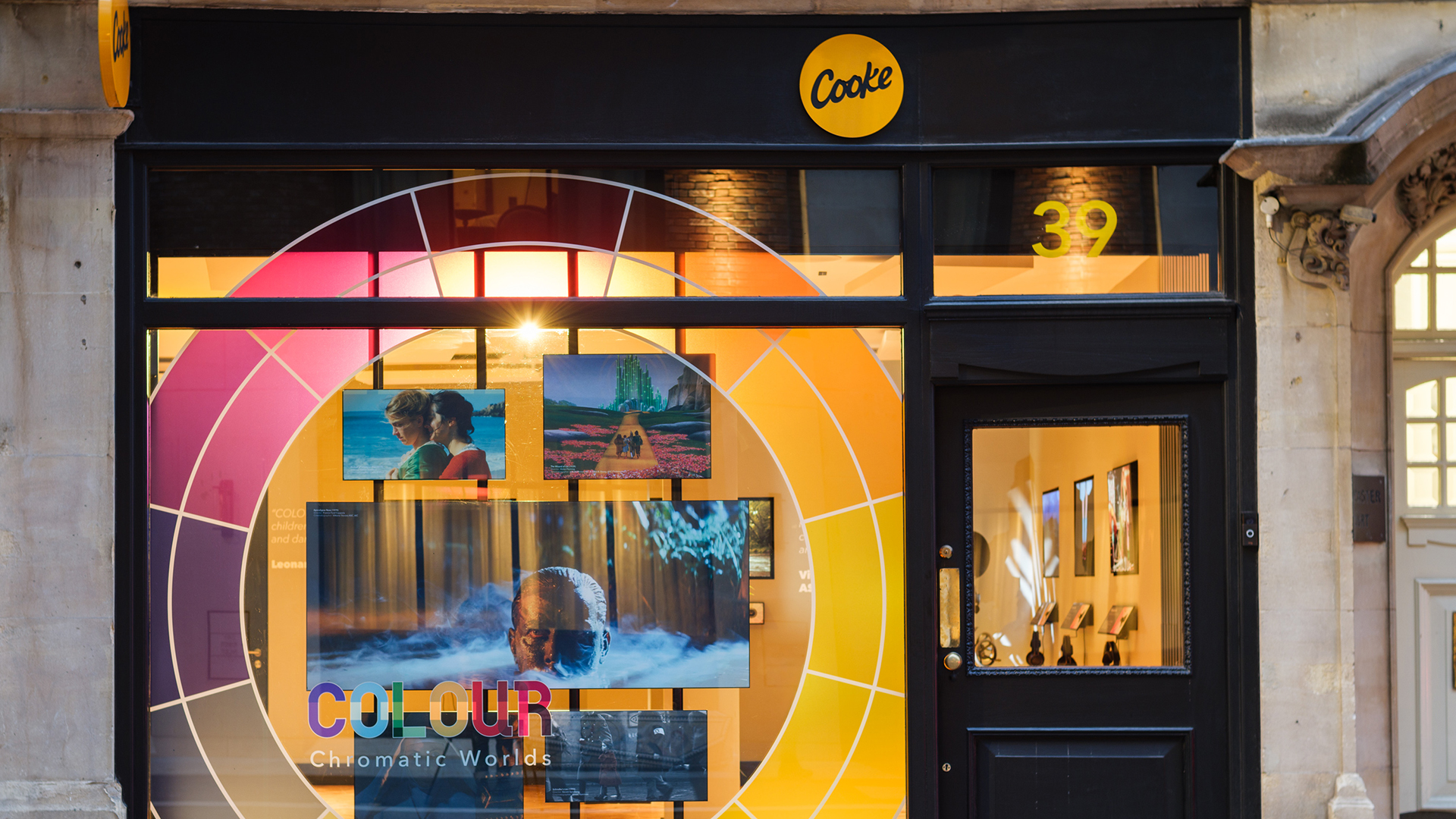
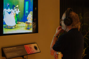
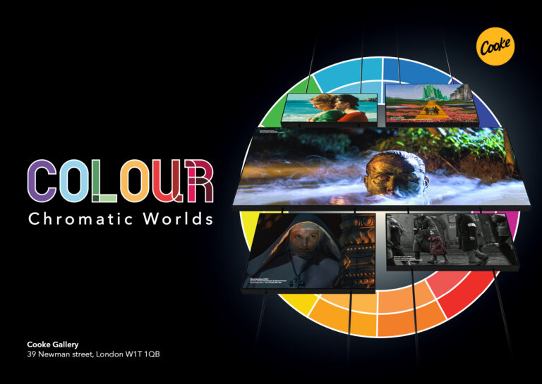
Currently at Cooke’s Gallery space in our London office we are running a video exhibition entitled “Colour: Chromatic Worlds”. Across seven screens we champion the pioneers who brought colour to cinema audiences and filmmakers who’ve used colour in groundbreaking ways. What follows is a taster of part one of this exhibition.
Colour first added to the dreamlike quality of cinema but soon it became an essential instrument of storytelling. From hand painting to stencils and full frame tinting, the beginnings of colour in film were their most powerful once filmmakers began to explore the meaning of certain hues. The evolution of colour technologies reflects the evolution of cinema itself, with each breakthrough providing a look unique to its moment.
The first forays into colour film exhibition began in the late 1800s. Coloured dyes were painstakingly hand-painted on top of black and white prints. The results were beautiful but the number of coloured prints that could be created was very limited.
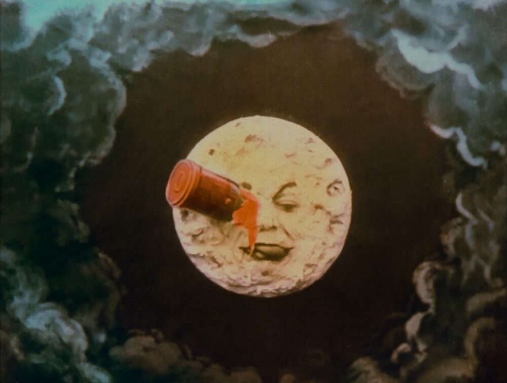
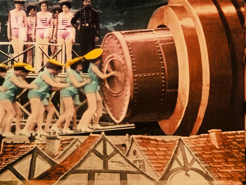
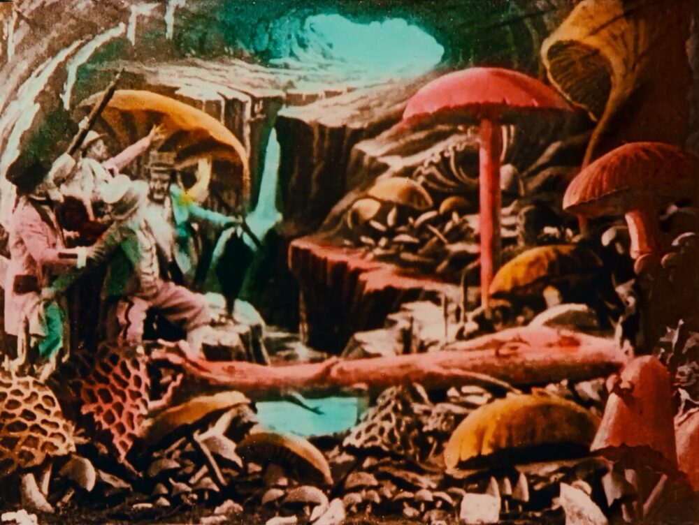
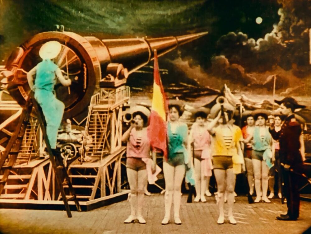
French visionary Georges Méliès’ 1902 film ‘A Trip To the Moon’ coined much of the visual vocabulary still used today – dissolves, multiple exposures and jump cuts. Colour depicted the fantastical and created a sense of wonderment for early moviegoers.
The film’s colourisation was meticulous and labour-intensive, carried out manually by overlooked pioneer Élisabeth Thuillier and her daughter Marie-Berthe who managed a workforce of over 200 female colourists. The firm structured its workforce in assembly-line fashion, dividing the labour by individual colour hue to increase productivity.
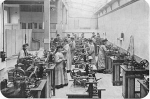
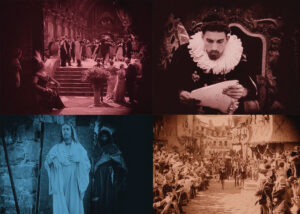
The Thuillier Workshop
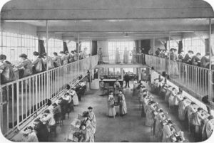
The Thuillier Workshop
Restoration of a print donated to a Spanish archive in 1993 revealed the French flag had been repainted as Spanish – an early example of colour’s political power. Hand-coloured prints cost ten to fifteen times more to produce than their black and white counterparts. Colour films remained luxury items for premium theatres until the invention of cheaper techniques.
Tinting involved immersing developed film in a chemical solution that would stain the photographic emulsion in the artist’s chosen tone. This affected the whole frame, but different tints could be applied to different sections at a fraction of hand-painting costs.
Director D. W. Griffith’s 1916 film ‘Intolerance’ weaves a grand tapestry between many time periods and locations. Individual scenes were tinted different colours to clarify these shifts for audiences.
This was the silent era, and everything from heightened performances to editing style was geared toward clear communication for audiences still learning how to watch movies. Breaks between time periods are marked by a symbolic image of a mother rocking a cradle, always tinted teal.
‘Intolerance’ – tinted. Director: D.W. Griffith, Cinematographer: Billy Bitzer
The choice of tint colour doesn’t follow a perceivable logic and historical accounts of the purpose behind the tinting vary – with different versions and reconstructions being available and no single version being seen as definitive. But over time and as techniques evolved filmmakers began using tints to create more deliberate associations.
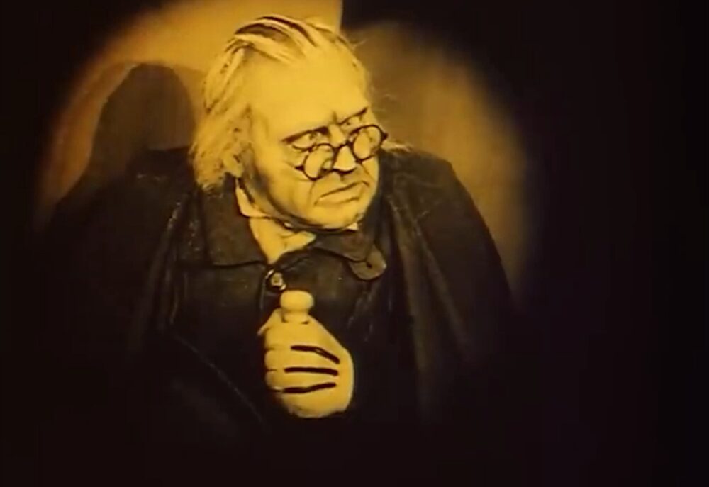
The Cabinet of Dr. Caligari is a 1920 silent film directed by Robert Wiene. It is considered the archetypal work of German Expressionist cinema and is arguably the first horror film. It tells the story of an insane hypnotist who enlists a sleepwalker to commit murders. The film has a dark and sinister visual style. Sharp-pointed structures dominate the frame. Landscapes lean and twist at unusual angles. On set, shadows and streaks of light were painted directly onto the walls.
When Dr. Caligari is first introduced to the audience the tint is yellow. The colour creates an uncomfortable feeling, and characters appear suspicious. When Cesare wakes up the tint becomes brown – the darkest colour used in the movie. Along with the paint under his eyes this creates an ominous atmosphere.
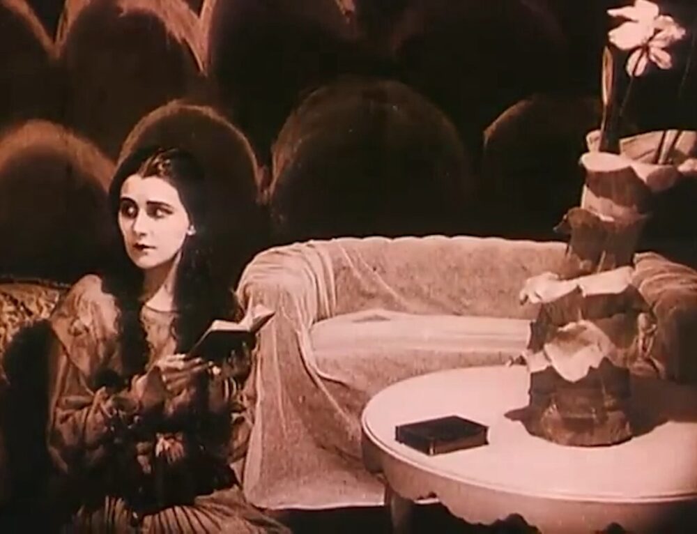
The film is tinted a cold blue as murder is shown via shadows on the wall. The geometric paintings become a metaphor for blood. Was red less associated with death at this point in film history? Or is this an early example of blue being used to represent night? Pink is associated with Jane who has two admirers. Does this serve as an early film example of aligning pink with attraction or femininity? The softer, curved shapes of her setting would suggest so.
Whole frame tinting contributed to early audience’s understanding of mood and emotion and by 1921 the technique had grown in popularity so much that Kodak launched sales of pre-tinted stock, expanding this technique to even more filmmakers.
These early colour techniques came from practical necessity – innovators aimed to match the full colour range of painting and elevate film beyond mere curiosity. But the most powerful images came from filmmakers who understood colour’s deeper meanings, transforming technical innovation into emotional language.
Further reading: https://wfpp.columbia.edu/essay/french-film-colorists/
and https://wfpp.columbia.edu/pioneer/elisabeth-and-berthe-thuillier/
Signup to visit the Cooke Gallery here. You will find films and explainers, presented chronologically, in which colour plays a critical role. Each film showcased uses colour to build atmosphere, set a tone, or manipulate our perception of the story unfolding on screen. Colour can transcend words, speaking directly to the viewer’s subconscious and shaping our experience of the narrative.