Search for lenses, articles and help
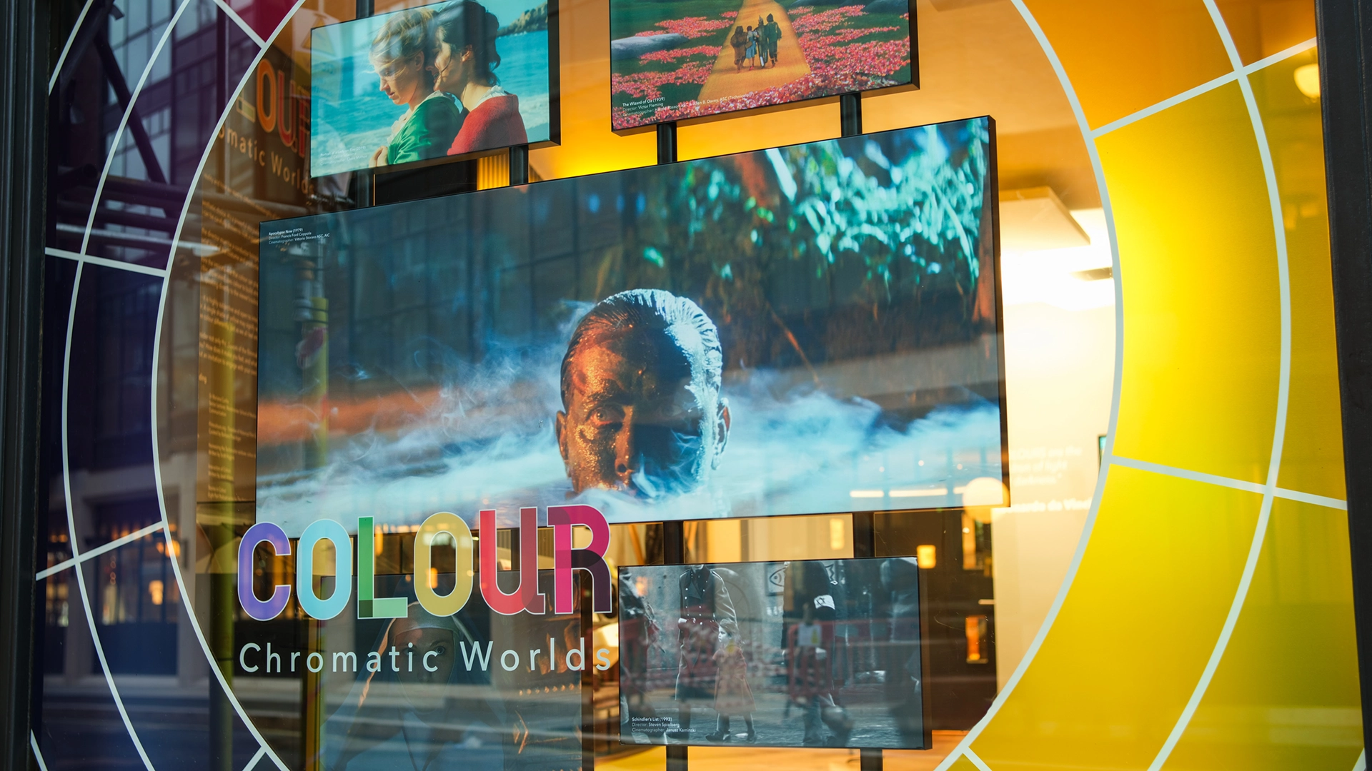
Currently at Cooke’s Gallery space in our London office we are running a video exhibition entitled “Colour: Chromatic Worlds”. Across seven screens we champion the pioneers who brought colour to cinema audiences and filmmakers who’ve used colour in groundbreaking ways. What follows is a taster of part two of this exhibition.
Post Great Depression America saw cinema rise to prominence as a cheap source of populist, escapist entertainment. Technicolor’s newly developed three-strip colour process would prove to be unlike anything moviegoers had seen before.
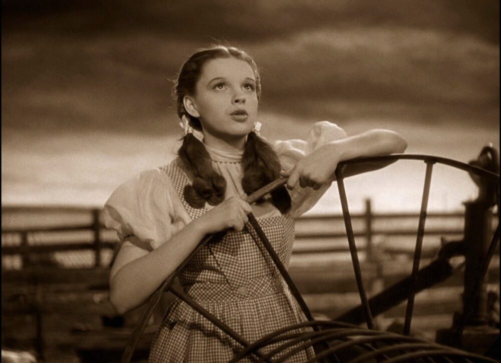
1939’s iconic ‘The Wizard of Oz’ serves as a showcase for the power of full spectrum colour. Bored farm girl Dorothy Gale lives a dusty and dreary life in a sepia depicted Kansas. The original book declared “the wind had taken the sparkle from Auntie Em and Uncle Henry’s eyes and the sky felt even greyer than usual”.
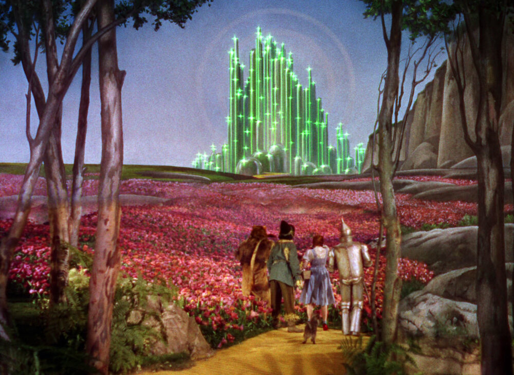
Dorothy conjures up a world beyond the rainbow where colours gleam and bedazzle – the merry land of Oz. The movie script saw silver shoes changed to ruby slippers, matching the vibrancy of the yellow brick road and the emerald city. Gemstones represent the glamour that Dorothy and audiences left home in search of.
Underneath all the charm and delight is a serious story about the struggle to find power, compassion, and courage. It’s about facing the green witches and blue monkeys of the adult world. Dorothy is ready to grow up and it’s the ruby slippers that carry her down the yellow brick road.
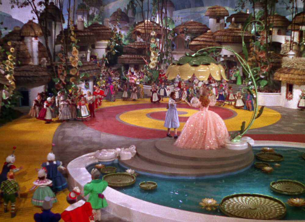
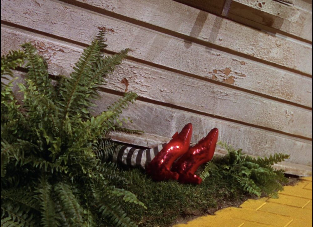
Red represents the power she seeks, and her pale blue pinafore lacks the strength to ward off scary trees and wicked witches. Yellow commands attention – it appears to “come forward” – like the warning sign in traffic signals. The yellow road promises happiness over the rainbow while warning of obstacles ahead.
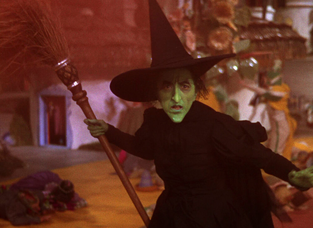
The Wicked Witch of the West is evil incarnate. Perhaps we have a genetic memory of venomous reptiles crawling up our backs or of escaping slime-filled swamps, as green skin triggers a deep aversion within us. When green is portrayed as emerald it takes on a certain charm but also an eeriness that we can’t quite put our finger on. Maybe a hint that The Wizard wasn’t quite all he seemed, was there from the beginning?
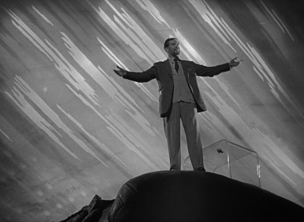
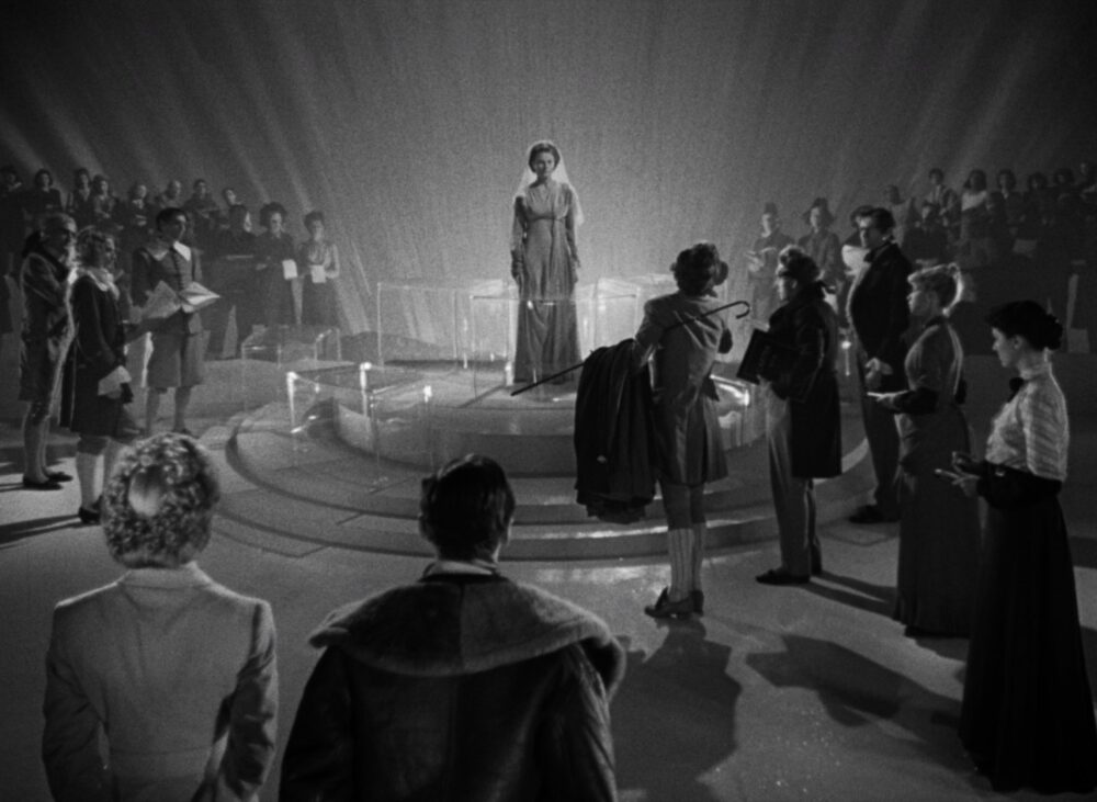
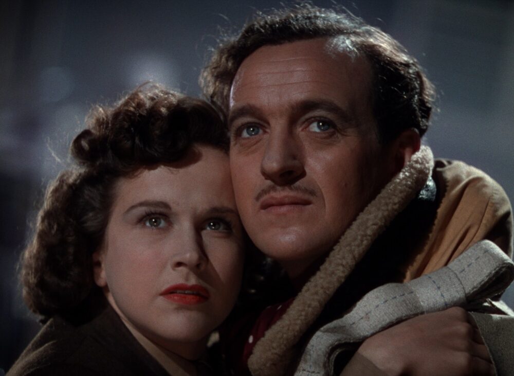
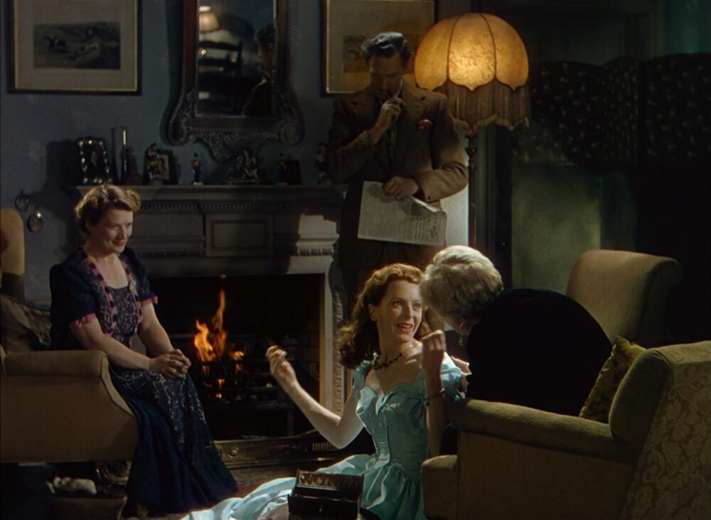
A few years and a Second World War later, 1946’s Powell and Pressburger epic ‘A Matter of Life and Death’ took the reverse approach to depicting colour compared to Dorothy’s adventure. RAF pilot Peter narrowly escapes death when ejecting from his plane during a bombing mission but only after making contact with allied radio operator June and falling deeply in love with her. The Afterlife notices Peter’s absence and a divine messenger is tasked with rectifying his lucky survival.
Our earth is vibrant Technicolor, and the afterlife is stark black and white. Was this reflective of a newfound passion for living a colourful, love filled life after years of war? The real-world bursts with golden light, pink roses, blue skies and June’s scarlet lipstick, while Heaven remains sparse and pearly monochrome.
Jack Cardiff shot the film impeccably on Technicolor film stock that was so scarce it had to be requisitioned from the British Ministry’s film department nine months in advance. For the black and white sequences Cardiff shot on the same colour stock but without the usual dyes. This allowed for seamless dissolves between the two worlds.
The afterlife is strict and regulated, literally black and white in its approach. Whereas life and love are colourful and evocative. Compared to ‘The Wizard of Oz’ desire is found in the real world instead of a fantasy one. Colour represents truth whilst helping to enforce the political desire of the film to foster Anglo-American relationships post World War II.
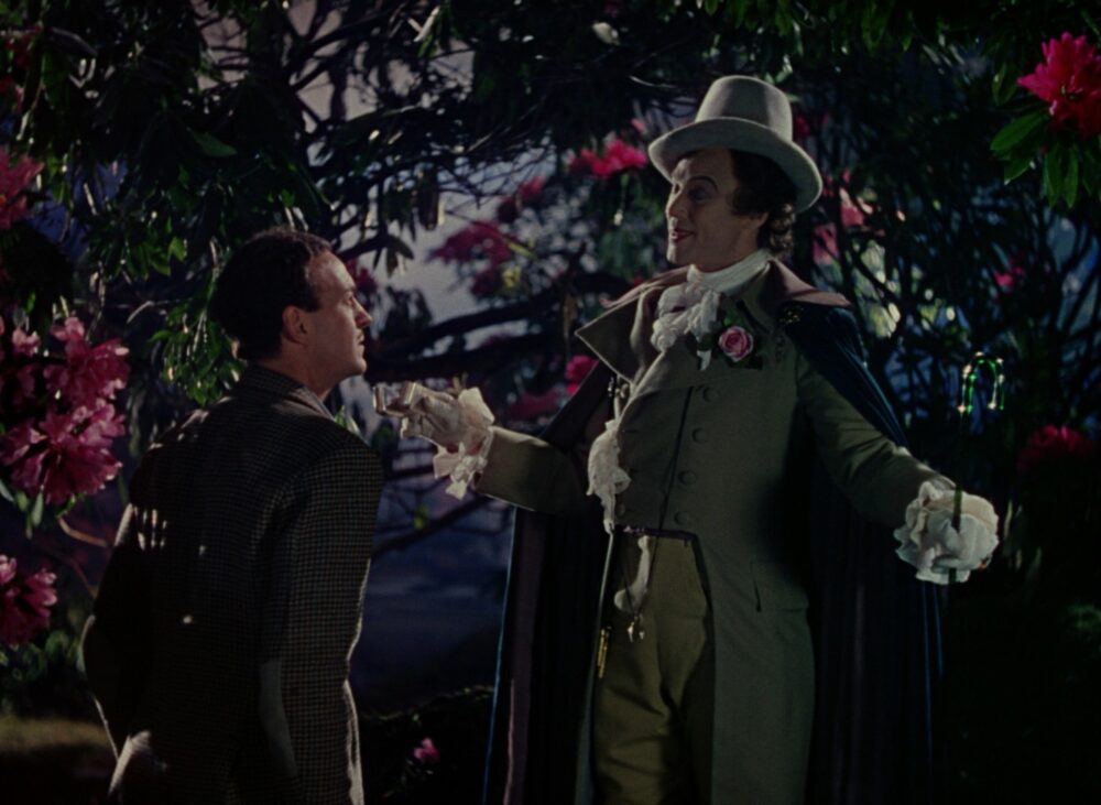
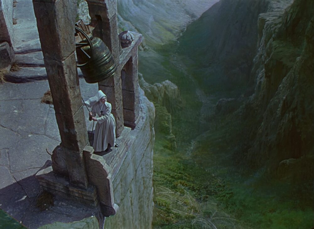
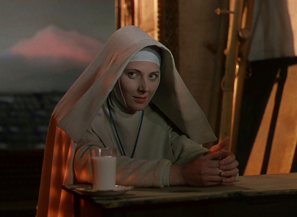
A year later the same troupe would release the sensually charged ‘Black Narcissus’. A flock of Anglican nuns set a course for a derelict convent high in the Indian Himalayas. A mission that tests their religious resolve. The production never strayed outside of London’s Pinewood Studios but a combination of incredible sets, expressionistic cinematography and astonishing matte paintings depict the exhilarating high-altitude setting.
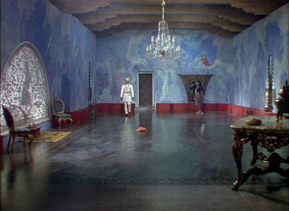
Juxtaposed against the nuns’ off-white robes, colour represents temptation: the rolling green hills, Darjeeling attire, even juicy tomatoes they dare not eat. Blue could be considered a key motif, its decadence being a counter to the ideal of cloistered purity. A pivotal exchange plays out in a deep-blue chamber, its walls embellished with erotic drawings hinting at the room’s past use as a harem.
In a flashback to Sister Clodagh’s pre-conversion days, she wears a cornflower blue gown as she prepares for a wedding that won’t happen. After renouncing the order, Sister Ruth reappears in a dress of maroon, and the setting sun drowns other scenes in a radiant orange. In hallucinatory intensity the final act swells with a raw hunger for life which spills out onto the screen and looks unlike anything else, just as Cardiff, Powell and Pressburger intended.
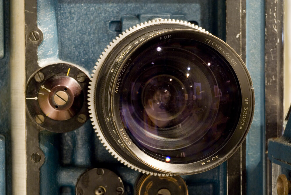
To achieve full spectrum colour capture J.A. Ball, Technicolor’s technical director completely redesigned the camera they had been using in the 1920s. The new camera was manufactured by the Mitchell Camera Corporation in Glendale, California and would be used from 1932 until 1954.
Unlike the two-colour system, which recorded the film on one strip of black and white negative, this new camera ran three black and white negatives simultaneously, hence the name three-strip Technicolor. The magazine on top of the camera was triple the width of a normal magazine as it contained three separate rolls of negative to capture the red, green and blue records.
Inside the camera, directly behind the lens, was the beam-splitting prism. This had a gold flecked, semi-transparent mirror at its centre, which allowed half the light to go directly through to the green record and the other half to be reflected 90 degrees onto two film strips in bipack – two negative films sandwiched together, emulsion to emulsion in the gate. The front film was the blue record. And on its emulsion was a red dye, which acted like the filter for the red record directly behind.
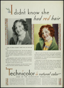
Technicolor Print Advert
When shooting in Technicolor, you weren’t just getting the camera. You rented from Technicolor an entire package, which included the camera, a camera crew with three assistants, the film, the processing, and a Technicolor colour consultant.
To dampen the sound, the Technicolor camera was enclosed in an enormous box known as a blimp. Made of metal with soundproofing material on the inside, it was four feet high, two feet wide, and four feet long, which brought the camera up to a weight of about 400 to 500 pounds (180 to 225kg). The blimp was so large that it was referred to by English cinematographers as the Enchanted Cottage. 29 three-strip cameras were manufactured between 1933 and 1950 for live-action photography. An additional three cameras were manufactured for animation, and another three were made for high-speed photography for slow-motion effects.
Born in January of 1889, Horace W. Lee obtained a Bachelor of Arts degree from Cambridge University in 1911 and, in 1913, joined Taylor, Taylor & Hobson in Leicester, England as assistant to optical designer Arthur Warmisham.
At TTH, Lee was responsible for the design of several pioneering Cooke lenses including the Opic series of 1920, the f/2 Speed Pancho, and the f1.3 Super Speed Panchro, which influenced the design of numerous high speed lenses for decades. In 1930, Lee also patented the first reversed telephoto configuration, for use with Technicolor’s three-strip cameras.
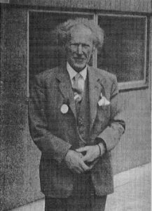
Horace W. Lee Photographed in 1961
It became evident to Lee that by providing for space behind the lens to accommodate the beam-splitting prism it significantly increased the flange focal distance on the camera and made it impossible to use any wide angle objectives. Lee’s solution was to use an inverted telephoto configuration to allow for a focal length shorter than the physical length from the imager to the optical centre of the lens, a first at the time and an innovation that paved the way for modern wide angle lenses.
During his prolific career, Lee lost his hearing, becoming totally deaf and had to have colleagues pass him notes on pieces of paper to communicate. Still, he penned many articles in scientific journals on lenses and other optical subjects and continued designing optics well into his 60s. He died in 1976 at the age of 87 and was survived by his wife, Grace, a musician.

Natalie M. Kalmus (1878-1965) was the executive head of the Technicolor art department and is credited as the “colour consultant” of all Technicolor films produced from 1934 to 1949, when Technicolor was deemed a monopoly. Her presence as adviser was a condition to which every producer seeking to use Technicolor had to agree. Kalmus’s job was to provide the director with colour schemes appropriate to the narrative.
Often credited as a co-developer of the Technicolor process itself, Kalmus was a member of the production team that shot the first Technicolor footage in 1917.She held strong views about the balanced use of colour in film composition and often clashed with directors, cinematographers, and studio set designers who in her view sought to overuse dramatic colours simply as random accents in scenes, too often, gratuitously or for theatrical effect.
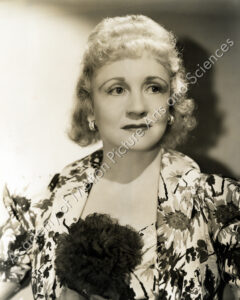
Natalie M. Kalmis circa 1930s
The following is a verbatim transcription of “The Significance of Colour”, one of the quick-reference charts “made by Natalie Kalmus” and published a 1932 Photoplay article written by Lois Shirley:
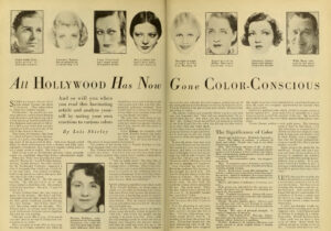
1932 Photoplay Magazine ‘Significance of Colour’ Article
Kalmus had both technical reasons and her colour charts for insisting on the use of specific colours for costumes, props, and lighting during filming with Technicolor cameras. In her efforts to ensure that colours were properly registered and reproduced, she was often accused by studio personnel of going to the extreme in set composition, of insisting on too many neutral or muted colours in scenes. “A super-abundance of colour is unnatural”, she once observed, “and has a most unpleasant effect not only upon the eye itself, but upon the mind as well.” She recommended “the judicious use of neutrals” as a “foil for colour” to lend “power and interest to the touches of colour in a scene.”
Her essay “Colour Consciousness” was initially presented at a meeting of the Technicians’ Branch of the Academy of Motion Picture Arts and Sciences in 1935. It is an elaboration of Kalmus’s aesthetic and nothing less than a blueprint for understanding colour patterns and associations intended in Technicolor films. One could say without risk of overstatement that Kalmus was a genuine auteur, a figure whose signature is as evident, if not more so, as the more celebrated directors with whom she worked.
Signup to visit the Cooke Gallery here. You will find films and explainers, presented chronologically, in which colour plays a critical role. Each film showcased uses colour to build atmosphere, set a tone, or manipulate our perception of the story unfolding on screen. Colour can transcend words, speaking directly to the viewer’s subconscious and shaping our experience of the narrative.