Search for lenses, articles and help
 The Revolutionaries
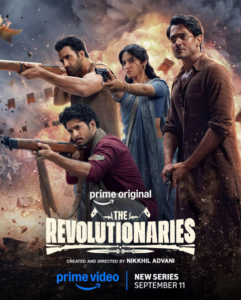
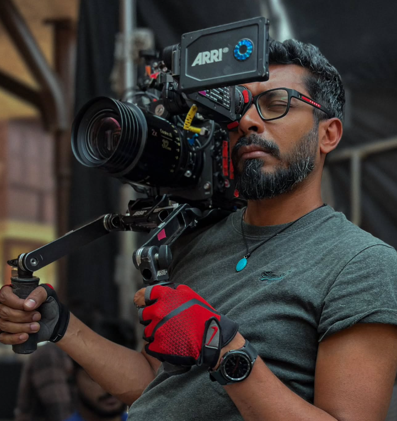
The Revolutionaries, directed by Nikkhil Advani, is an eight-episode period action-thriller for Amazon Prime Video, based on Sanjeev Sanyal’s Revolutionaries: The Other Story of How India Won Its Freedom. Cinematographer Gairik Sarkar approached the series with the ambition of giving its historical world the scale and visual character of classic cinema while retaining the flexibility required for a contemporary, action-driven production.
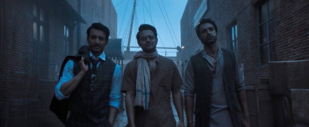
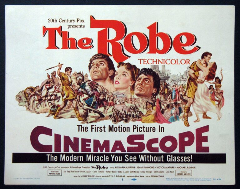
From the beginning, Sarkar and Advani shared a clear visual ambition: to create a period world influenced by the great CinemaScope adventure films of the past. Lawrence of Arabia, Where Eagles Dare and The Guns of Navarone were important cinematic references for both filmmakers.
One of the most significant creative decisions was the choice of a 2.35:1 CinemaScope aspect ratio. Sarkar and Advani worked with Amazon to secure approval for the format, which is uncommon for an OTT series.
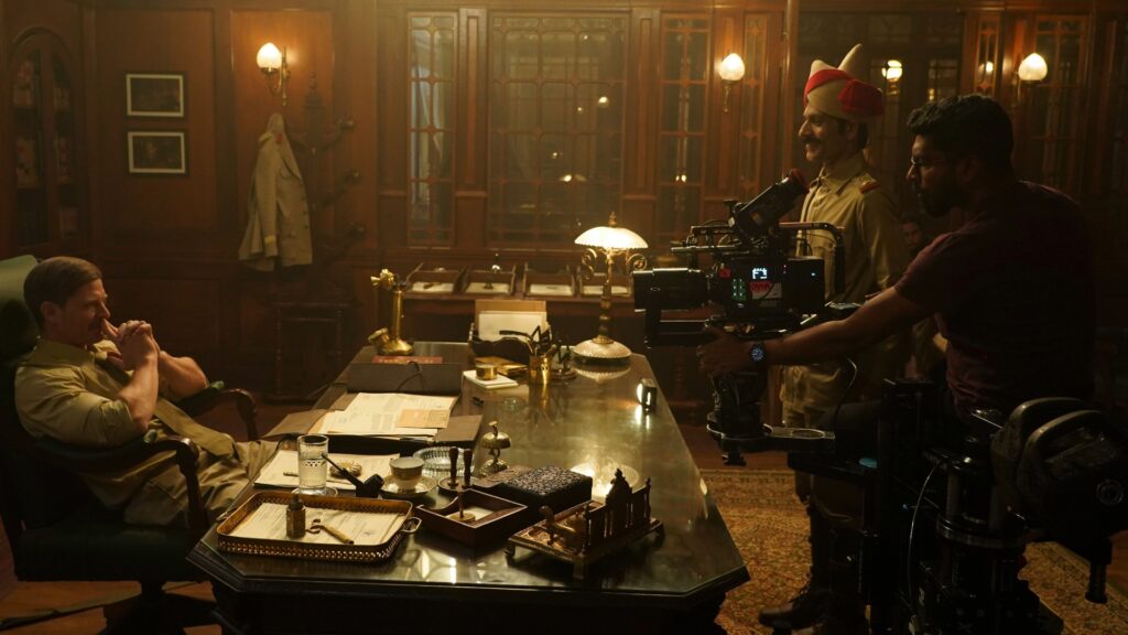
The intention was to create an expansive, old-school cinematic frame in which architecture, landscape, action and character could coexist within the same composition.
Once the format was approved, anamorphic photography became a natural choice.
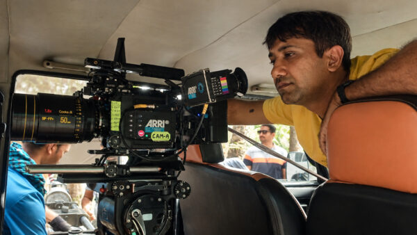
Sarkar initially considered a Large Format ARRI ALEXA paired with Cooke 1.8x Anamorphic lenses. The production, however, required high-speed capture for its action sequences, leading the team to the ARRI ALEXA 35 and Cooke 2x Anamorphic lenses in Super 35.
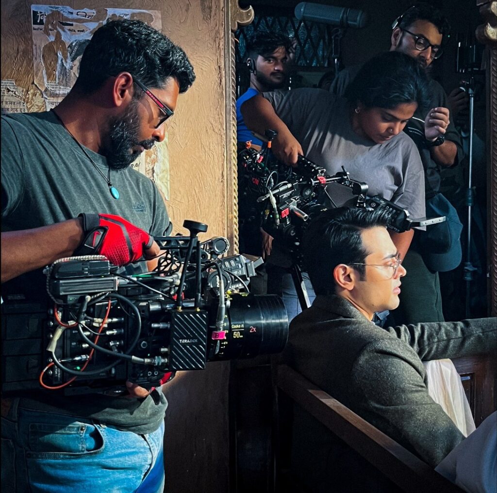
“Initially I thought I would shoot Large Format Alexa with the 1.8x Cooke Anamorphic. But we needed a lot of high speed because of the action, so we went to the Alexa 35. Then I used the Super 35 2x Cooke Anamorphic for the show.”
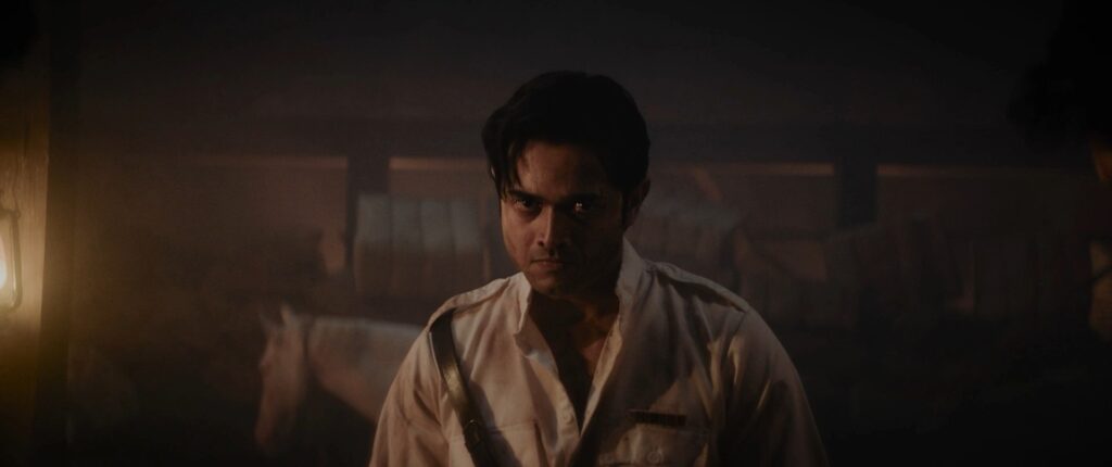
The combination delivered the anamorphic field of view and widescreen perspective Sarkar wanted while accommodating the practical demands of the shoot.
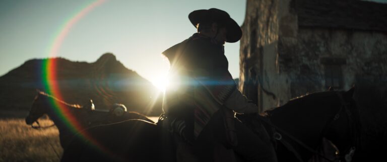
For Sarkar, the Cooke Anamorphics were a familiar tool. He valued their optical character, particularly their restrained flare, veiling flare and distortion.
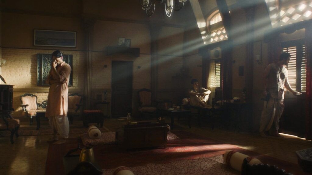
“The coating characteristics are very mild. You don’t get too much flare or too much veiling flare or too much horizontal flare.”
That control was particularly useful when working with practical and ambient sources. With a demanding schedule, Sarkar could not always meticulously flag every light entering the frame, so the lenses themselves provided a degree of optical discipline.
Another important characteristic was their minimal barrel distortion. With handheld photography, tracking and rapid panning forming part of the visual language, excessive edge movement could have become distracting.
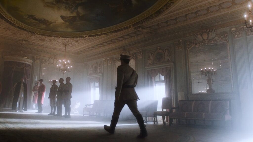
“What I really like about it is that the barrel distortion is minimal. When you’re panning or tracking, that whole effect of the edges constantly moving is not there.”
“I didn’t want the lens to feel that anamorphic. I just wanted the field of view of the lens to be anamorphic.”
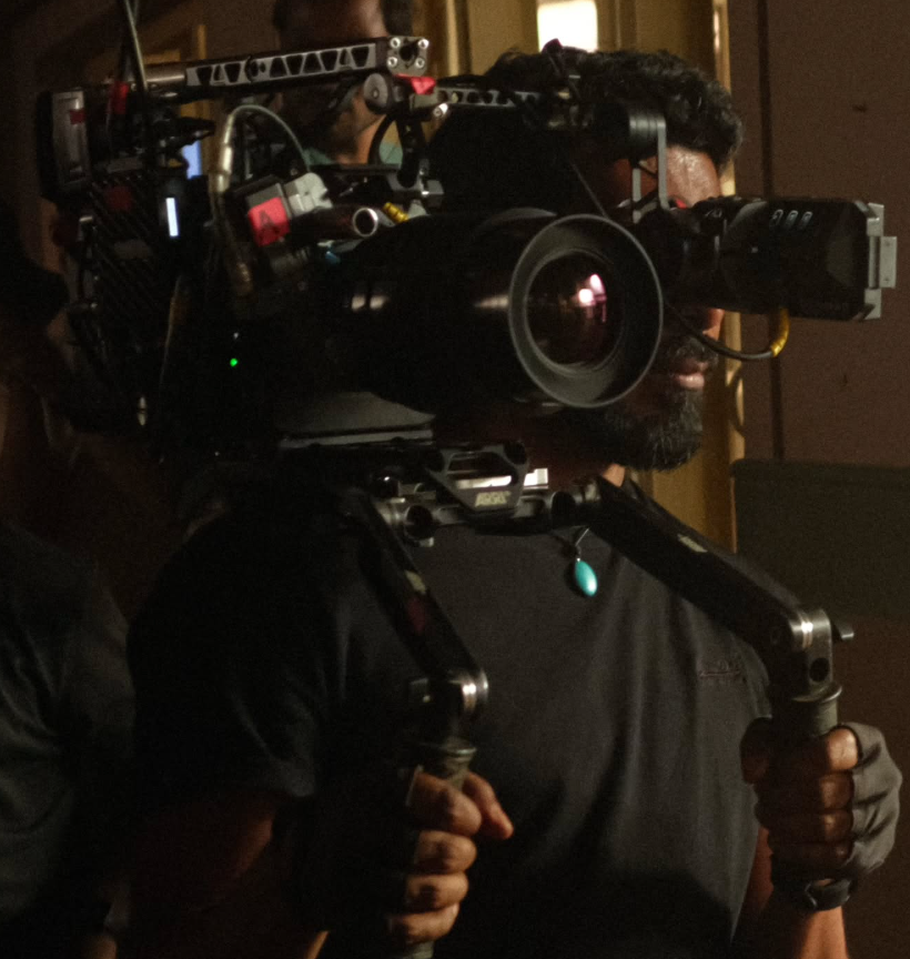
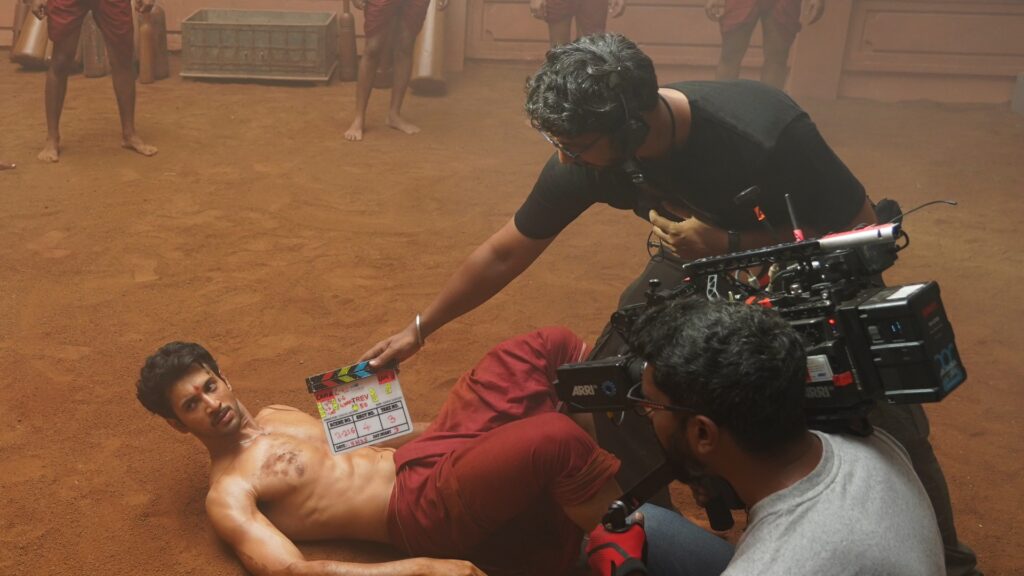
Nikkhil Advani wanted a substantial portion of the series to be shot handheld, reflecting the youthful energy and restless spirit of the revolutionaries.
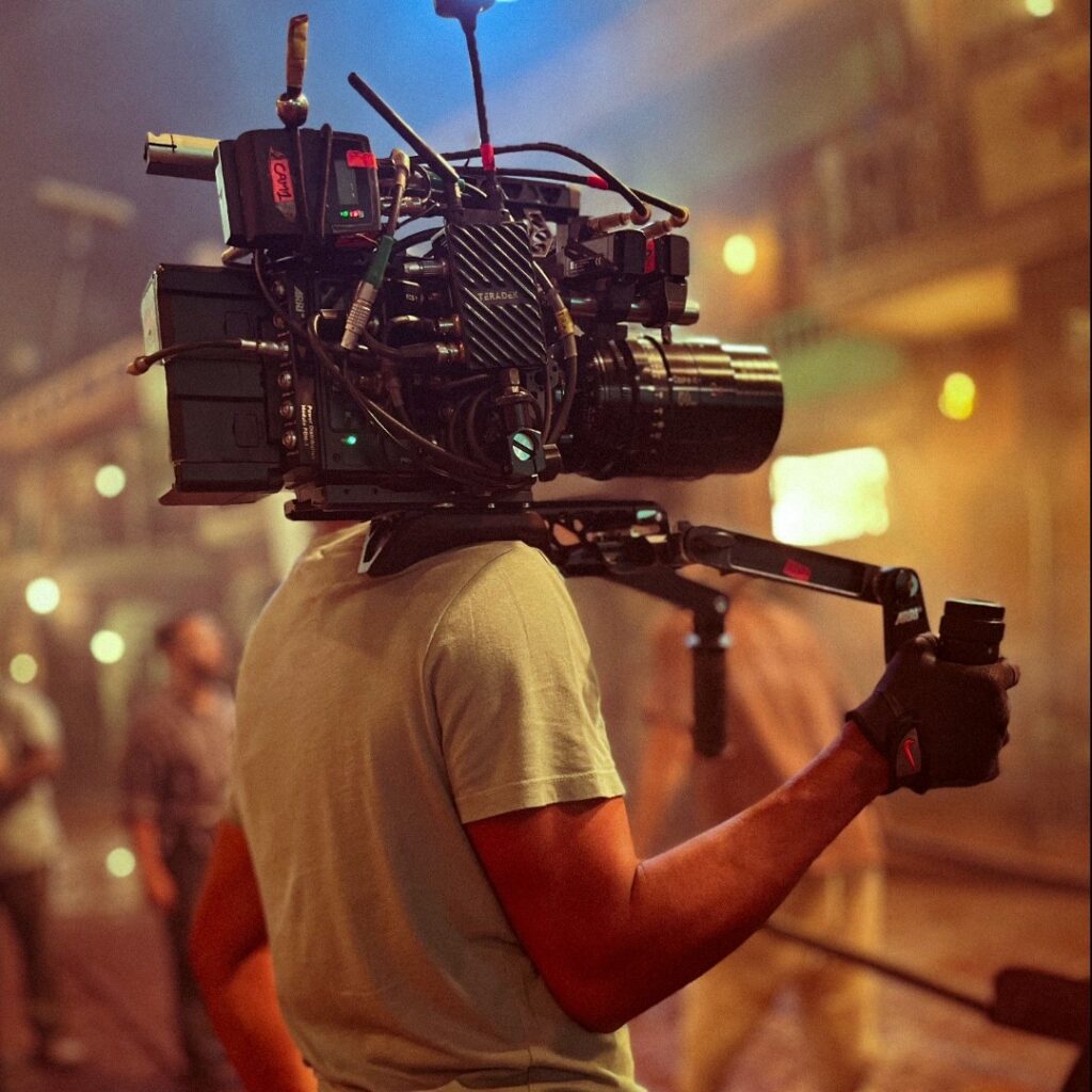
Sarkar, however, prefers a heavier camera package for handheld work because it provides greater stability and minimises distracting movement. The Cooke Anamorphics, being relatively heavy lenses, worked well in this configuration. When properly balanced with the ALEXA 35, the camera sat comfortably on the shoulder and could be operated handheld for long durations.
The weight of the package therefore became an advantage rather than a limitation, allowing Sarkar to combine the immediacy of handheld photography with a controlled, cinematic image.
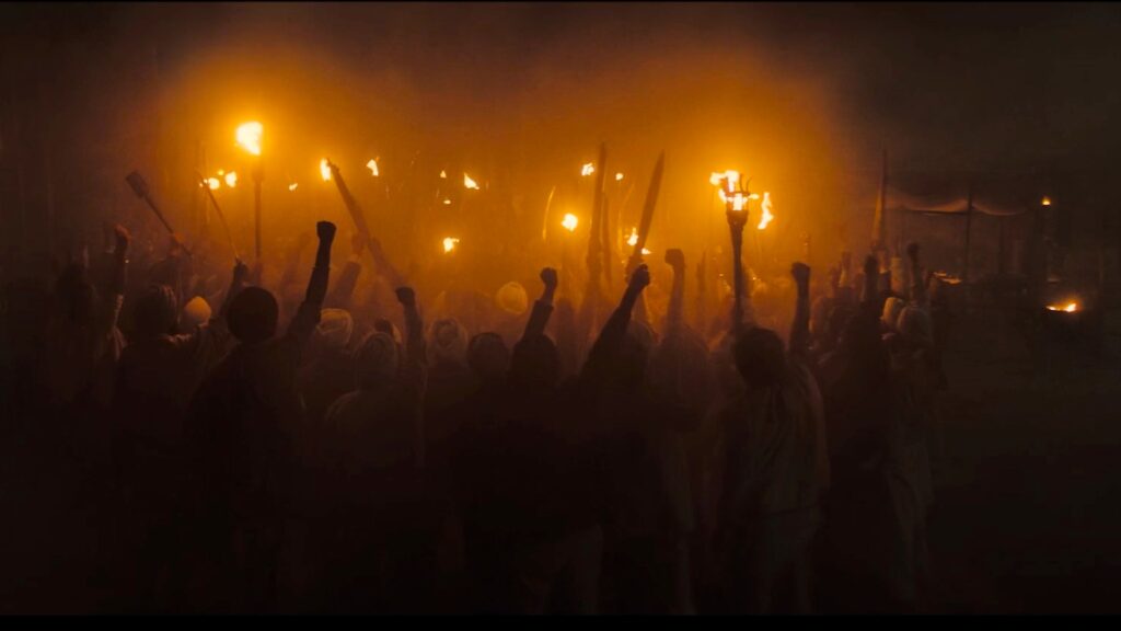
The 25mm Cooke Anamorphic became an important lens for establishing the expansive world of the series. Its field of view is approximately equivalent to that of a 12.5mm spherical lens, while maintaining remarkably controlled distortion.
This was particularly valuable for architecture and landscapes, where excessive curvature could have made the environment feel artificially distorted.
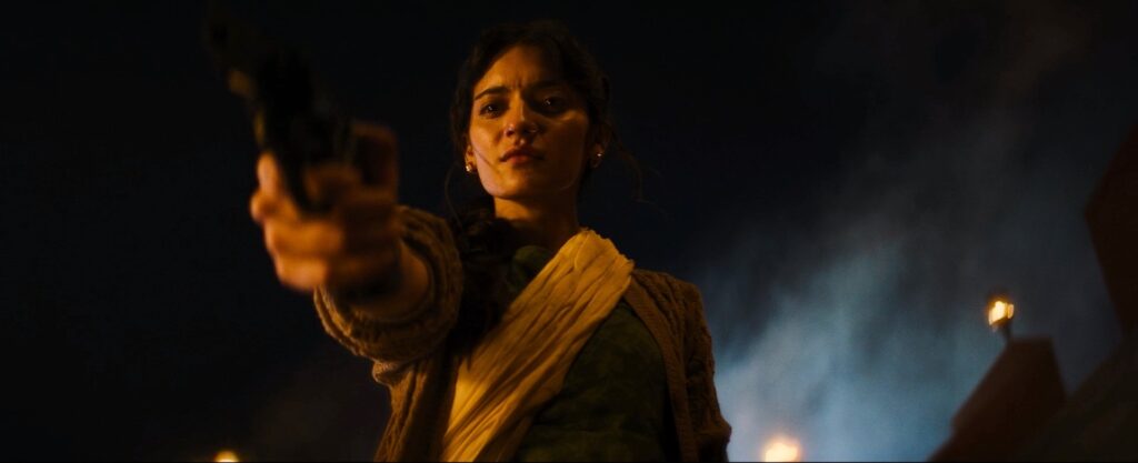
“I like lensing that is as natural as possible and which does not draw too much attention to itself.”
The other two most-used lenses were the 40mm and the 65mm Macro, with the latter becoming particularly useful for character close-ups.
The philosophy remained consistent: use the anamorphic format for its field of view and cinematic perspective without allowing the lens characteristics to dominate the image.
The lens choice was part of a broader visual system established by Sarkar and Advani before principal photography.
Rather than relying heavily on colour grading to distinguish locations, they designed different colour environments through lighting, production design and natural sources.
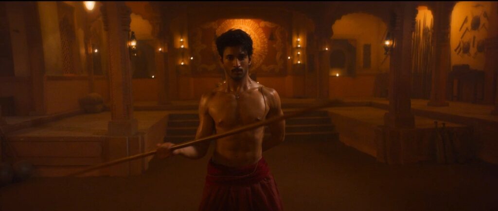
Calcutta was conceived as cooler and overcast, with soft daylight filtering through windows. At night, LED sources were tuned toward a cooler white rather than conventional tungsten warmth.
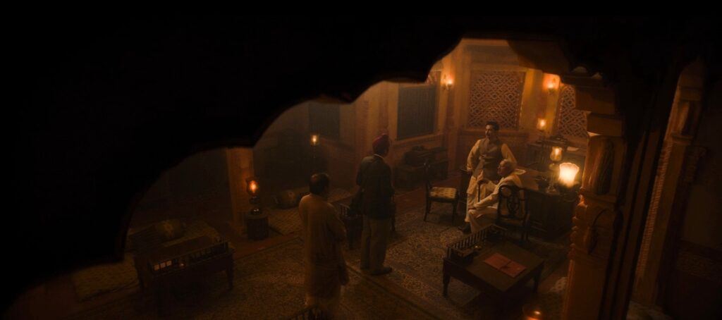
Banaras was defined by organic warmth from lanterns, open flames and fire sources. Delhi had a separate quality of warmth, created primarily through incandescent bulbs.
These distinct environments gave each location an immediate visual identity.
Different times of day were consciously written into the script as part of the storytelling language. Golden hour, blue hour and sunset were not simply opportunities for beautiful light; they were used to denote the passage of time and to heighten the drama and emotional mood of particular scenes.
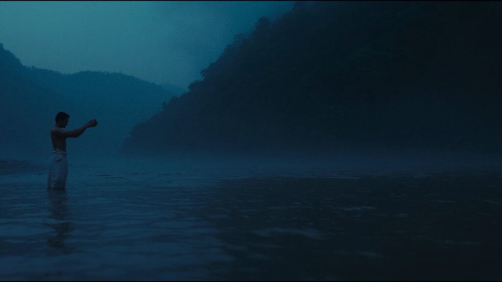
Sarkar deliberately enhanced the natural colours and qualities of these periods rather than treating them merely as photographic effects.
Blue hour was also built into the shooting plan. Certain sequences were specifically designed around morning or evening blue hour.
A riverside prayer sequence, for example, was intentionally photographed during morning blue hour to achieve its distinctive cool atmospheric quality.
Time itself therefore became part of the visual storytelling.
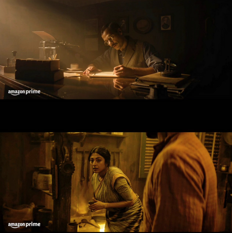
One of the major influences on the physical texture of the series was Akira Kurosawa’s Ran.
Sarkar and Advani wanted smoke, dust, wind, fire and rain to become active visual elements rather than decorative effects. These elements helped create an environment that felt lived-in, volatile and physically present.
For a period drama, historical authenticity extended beyond costumes and architecture. The production incorporated smoke, dust, rain and wet-downs, partly reflecting the historical presence of chulhas and open-fire cooking sources.
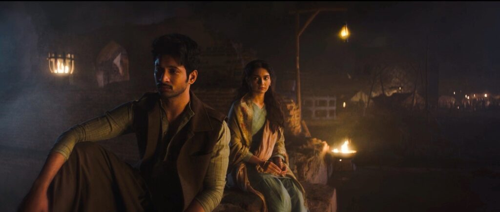
“We wanted to use a lot of these as background elements and also in the scene to add a lot of texture. We used rain and wet-downs to add more realism to the sets we had built.”
Interior scenes relied on conventional haze machines, while large exterior environments used diesel guns to create thicker white smoke. The smoke was designed to have believable sources within the world something that could plausibly emerge from a kitchen or household rather than appearing as generic atmospheric haze.
At the same time, the moving smoke added depth and movement to large compositions, particularly when interacting with wind and shafts of light.
The wide shots were deliberately expressionistic and dramatic. Rather than simply establishing geography or production scale, Sarkar used architecture, landscape, light shafts, texture, colour and shadows to reflect the emotional state of the characters.
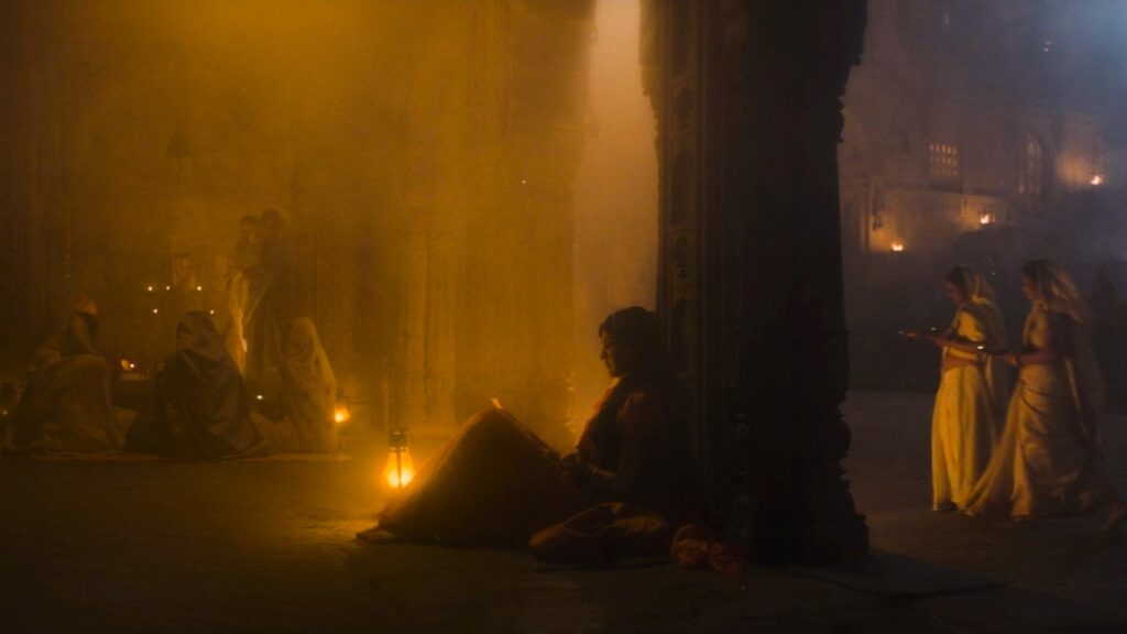
“All the wide shots are very moody, with sharp shafts of light, showing the architecture and showing the world.”
The environment consequently became part of the characterization. A landscape could suggest freedom, confinement, uncertainty or danger; architecture could create scale or isolation; and light and shadow could mirror the emotional temperature of a scene.
The 2.35:1 frame provided the canvas for this visual language.
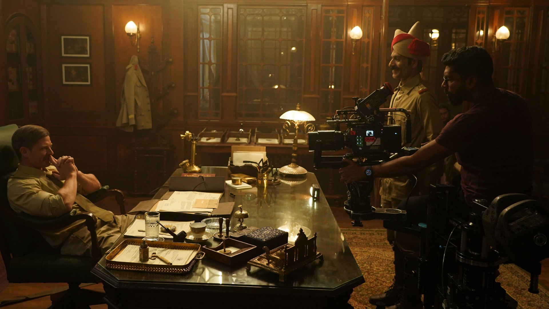
Approximately 70 percent of the series was filmed on sets, making production design a crucial part of the visual world.
Production designer Surabhi Verma created highly detailed environments that supported the scale and historical scope of the story. The sets were designed not merely as backgrounds but as spaces in which the camera could move, discover depth and build compositions.
The combination of detailed production design, wide anamorphic photography, atmospheric texture and dramatic lighting allowed Sarkar to make the constructed environments feel expansive and geographically convincing.
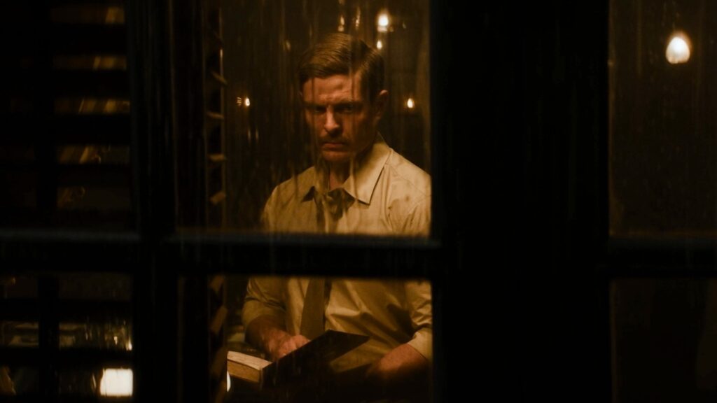
Sarkar and Advani consciously pursued a more contrast-heavy visual language, allowing darkness, silhouettes and atmospheric density to remain within the image.
“We wanted the real deep silhouettes and dramatic lighting and wide shots, just to make it more cinematic and not be like a normal OTT series.”
The visual identity of The Revolutionaries therefore did not depend on the lenses alone. It emerged from the combination of CinemaScope framing, Cooke Anamorphics, practical sources, location-specific lighting, natural transitions of light, atmospheric texture and large-scale production design.
The scale and schedule of the production demanded an extensive cinematography team.
Second-unit DoPs Rusha Bose and Abhijit Vivek shot approximately 30 percent of the series in parallel with the main unit, often working in different parts of the same locations. Their contribution was essential to completing the production within the demanding 78-day schedule.
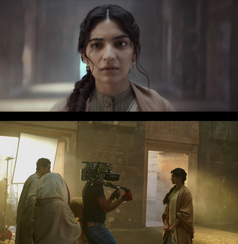
Sarkar’s associate cinematographer Hiru Mondal managed the cinematography department and executed large and complex lighting setups with the support of gaffer Sajid Shaikh.
Key grip Sarwar Shaikh played an important role in executing complicated dolly movements efficiently, helping translate Sarkar’s elaborate camera ideas into practical setups on set.
The final image was shaped in collaboration with colourist Michele Ricossa, whose core philosophy was to keep the grading invisible while retaining visual drama.
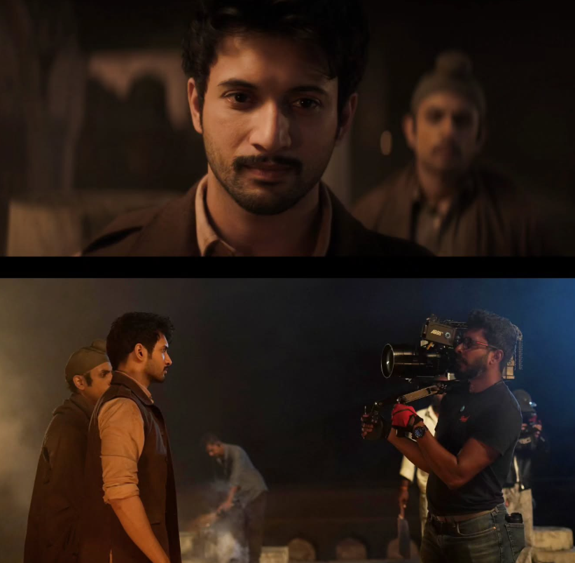
The intention was not to make the colour grade announce itself, but to preserve the visual decisions made during production—while refining contrast, colour relationships and atmosphere to support the storytelling.
This philosophy complemented Sarkar’s approach to the Cooke lenses: the technology and craft should serve the image without drawing unnecessary attention to themselves.
For Sarkar, the attraction of the Cooke 2x Anamorphics ultimately comes down to control
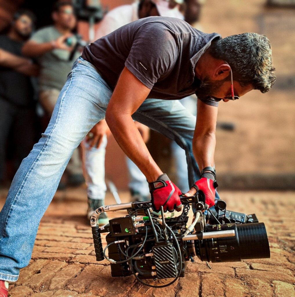
“We wanted that expansive, widescreen feel without losing control of the image. The Cooke Anamorphics gave us the 2.35:1 cinematic frame we were looking for, with restrained flare and minimal distortion, even in the most demanding shooting conditions.”
Rather than using anamorphic photography primarily for obvious optical effects, Sarkar used it to establish space, scale and perspective.
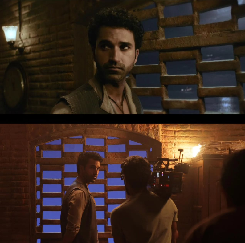
The result is a period world that feels expansive without becoming excessively stylised: a cinematic image shaped by the relationship between the lens, the architecture, the light, the atmosphere and the movement of the camera.
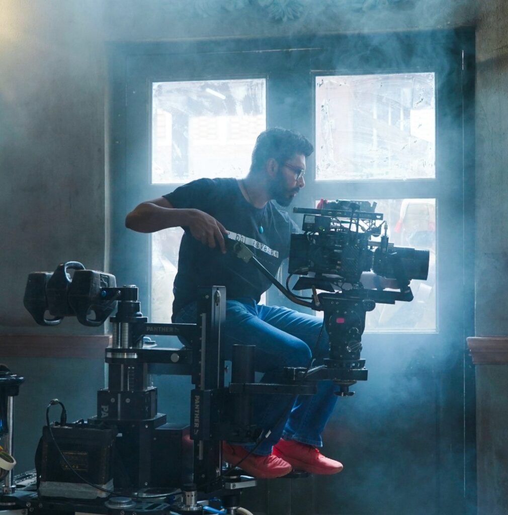
Gairik Sarkar| Director of Photography
Supported By: Camera & Equipment Rental | FutureWorks