Buscar objetivos, artículos y ayuda
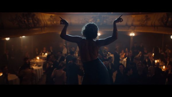
Helene is a story about the period of life of famous Finnish painter Helene Schjerfbeck (lived between 1862 – 1946).
“Helene is a story about the period of life of famous Finnish painter Helene Schjerfbeck (lived between 1862 – 1946). The film portrays the period of her life during which she is struggling with artistic ambitions, poor living conditions, the male dominant atmosphere both at home and in art society and finally her struggle with a desperate enchantment to the younger man. These events shape her character as an artist and a woman.”
Lens/Camera Information
Lens series: Anamorphic/i 2x
Focus lengths: 32mm, 50mm, 75mm, 100mm, 180mm
Original Aspect Ratio: 2.39:1
Camera: Sony Venice 4K / 4:3, resolution 4096 x 3024. Preston Light Ranger focus-unit
Format: Digital
Rental Company: Valofirma with Camera Equipment from Camera Kamerafirma https://valofirma.fi/fi/
DOP Information
Director of Photography: Rauno Ronkainen FSC
Linkedin: https://www.linkedin.com/in/ronkainen-rauno-b9939410a/
Production Information
Production: Helene
Producers: Antti Jokinen, Mikko Tenhunen, Evelin Penttilä
Director: Antti J Jokinen
Colourist: Pentti Keskimäki
Post Production Company: Post Control https://www.postcontrol.fi
Production Company: Cinematic https://www.cinematic.fi
Distributor: Nordisk Film https://nordiskfilm.fi
IMDB: https://www.imdb.com/title/tt9742588/
Awards
Camerimage Main competition Silver Frog Winner 2020
Shanghai international Film Festival, Golden Goblet 2020 nominee
DOP Rauno Ronkainen FSC on his lens choice:
“I tested these Cooke anamorphic lenses already few years before this production for another production. Sadly, distribution requirements didn’t allow us to use the full potential of anamorphic so we ended up to other solutions. Still, our excitement of the experiences during this testing period convinced us, me and the director, that we must use this set in our future production that was film Helene. It would be too easy and uninspiring to use our aim to be only “more cinematic”. Even if this is true, this doesn’t actually describe accurate enough our true goals, reasons and desire to use these lenses. The look and characteristic bokeh of Cooke anamorphic set is in general something that immediately allowed me to transmit the film’s eye inside the story’s events. Not as an observer but rather as a spirit that is allowed to experience the atmosphere of these distant events. The difference is huge – at least by my opinion.
We didn’t just want be present on the scenes and show what was happening – or what we were presuming that has happened. Instead, we wanted to create this odd reality of dreams where one seems to follow the plot and see everything but at the same time feels that atmosphere and subconscious are more important and effects stronger to the experience. This film is fiction. We didn’t have any need to create the world that needed to be and feel ultra-realistic. This film was our interpretation of these events and our protagonist’s life. So, we wanted to tell this story on our own way – visualising main character’s emotions.
Anamorphic format gave me the impression about “seeing the events through the keyhole” – looking distant events through narrowed frame. That means that I tried to achieve the same curious feeling for the audience, as people tend to have, when they have to peek through a hole and they are forced to imaging things outside the frame by the hints that we gave but left only in shadows or distant sounds.
I also strongly felt that this helped to create the right sense of past period in this film – and in this film exactly.
All this, I think, was possible since using anamorphic wide angles created little bit unrealistic field of view that allows the audience to see and feel that this is not exactly normal what they are witnessing. All anamorphic distortions and changes of the image quality with different T-stops just helped us to add the feeling that we desired.
All lenses in the set behaves a little bit differently with wide open and with different apertures. They also have important different qualities that can be best described by “the feeling of being present / inside the circle of action” or qualities that I consider to create the feeling of presence or distance. By playing with these technical differences we managed to tell this story – and hopefully impact to the audience – as we wished.
It is still vital to understand that I never felt that these lenses would lack of any unique and solid look. There is a certain look that seems to waft over the whole set – undescribed to me but somewhat distinguish and fascinating. But still, inside this specific look they had qualities that helped me to paint with lenses – not only with the light and camera choreography.
In general, I don’t have any solid opinion to make decisions to choose lenses with same principals every time. Sometimes I want to make things as ready in the camera as possible (like in film Helene where we didn’t use a single distortion correction in the post). Sometimes it makes more sense to do these things in the post by altering the image quality and sharpness for example in different layers of the image. Regardless the workflow phase inside the production where I manipulate (or don’t manipulate) the imageis the key phase and it should (must) fit to the aims of creating the content. Visual storytelling by features of image (lenses), light & shadow, color, choreography and rhythm should be in relationship with the films deep content. Yet this relationship is volatile concept. How these should be in relation to the content? This comes to the selection process of the lenses. I still haven’t find any better rule for selecting “right lenses” that they just have to somehow match to my vision! Vision that is usually made by instinct and sometimes require even leap to the unknown. Of-course there are some reasonable and technical factors that select lenses should fulfill concerning filming and distribution circumstances, but in general, the final decision is quite often made by – artistic feeling. ”